Identify
Understand what is happening to a plant.
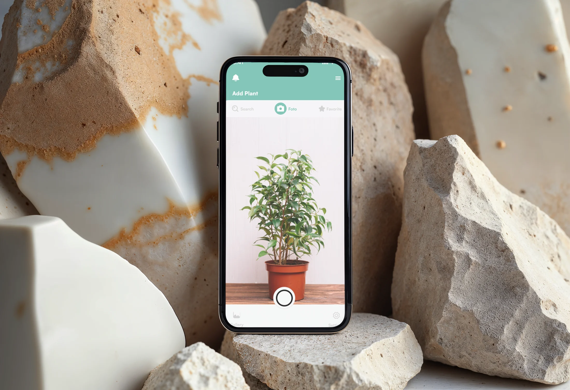 ← Back to projects
Caring for a plant seems simple until something goes wrong.
What is happening to it?
How can I help it recover?
Am I doing the right thing?
The problem was not a lack of information, but the difficulty of turning scattered information into a clear decision.
Plant-Me was created to transform that uncertainty into a clearer, guided and easier-to-follow care experience.
It was not about offering more information, but about helping people make better decisions.
Understand what is happening to a plant.
Turn scattered information into clear steps.
Make follow-up easier without adding complexity.
Before defining the interface, I needed to understand how people actually cared for their plants and what difficulties they found during that process.
Interviews, the survey and benchmark analysis revealed three insights that guided every design decision.
People were not looking to learn more about plants.
They needed to know what to do when a specific problem appeared.
Information was scattered.
Solving one question meant consulting different sources, creating more uncertainty than confidence.
The phone was already part of the process.
The camera, immediate access and in-context use made the phone the most suitable environment for supporting daily care.
In-person, 20–40 min, with and without prior plant-care experience.
Online responses, to validate the patterns at scale.
FindingDidn't know common plant diseases.The finding that made photo-based diagnosis the core feature.
She lives with several plants, learns independently and looks for reliable information to anticipate problems.
He has just bought his first plant. He needs to understand the essentials and act without checking multiple sources.
The journeys keep only the points that help explain what needed to change in the interface.
Looks for specific information.
Compares advice and features.
Organises care by plant.
Checks alerts and progress.
Scattered sources.
Advice is too generic.
Information lacks priority.
Easy to forget to return to the app.
Clear benefits from the start.
FAQ and contextual help.
Personalised dashboard and calendar.
Relevant reminders.
Creates an account or logs in.
Scans a sick plant.
Checks care tips and supplies.
Checks its progress.
Does not yet understand the value.
Does not know where to start the scan.
Does not know which solution to prioritise.
Has no follow-up habit.
Short, explanatory access.
Visible camera CTA.
Ordered, actionable steps.
Simple guidance and reminders.
Every screen was sketched by hand first, marking key points — buttons, messages and decisions — in colour.
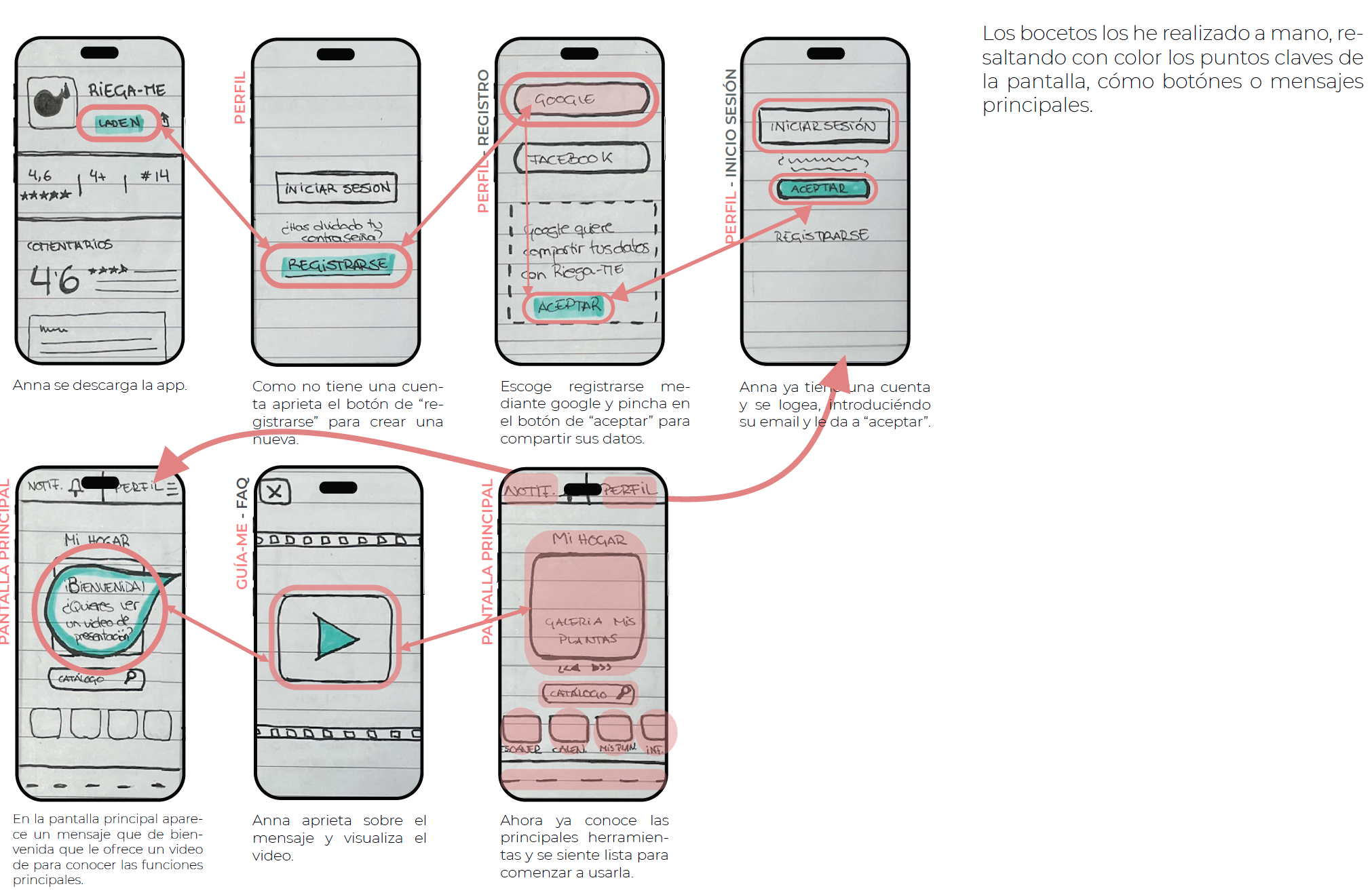
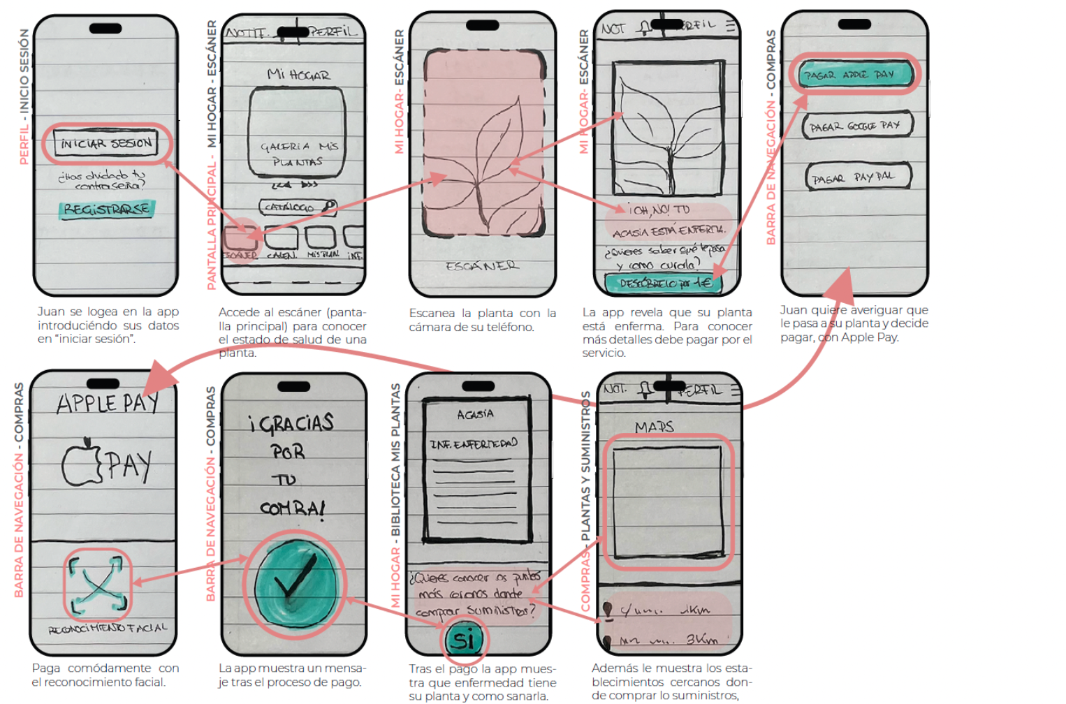
The flows connect orientation, diagnosis and action without forcing users to interpret technical information on their own.
Card-sorting participants, to define how sections should be grouped and labelled before finalising the navigation.
The first journey links download, registration or access, welcome and tutorial. It then leads to the home screen and Guide-Me, progressively introducing guided plant care.
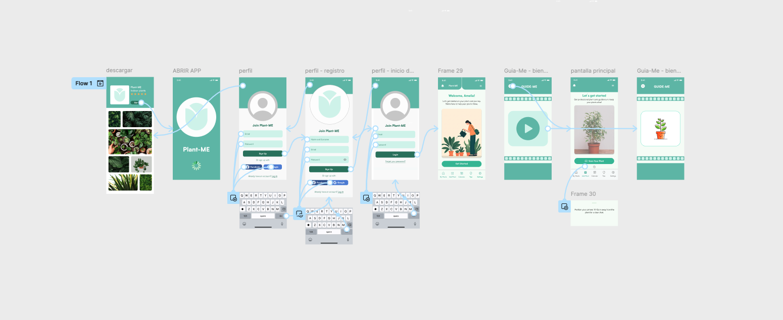
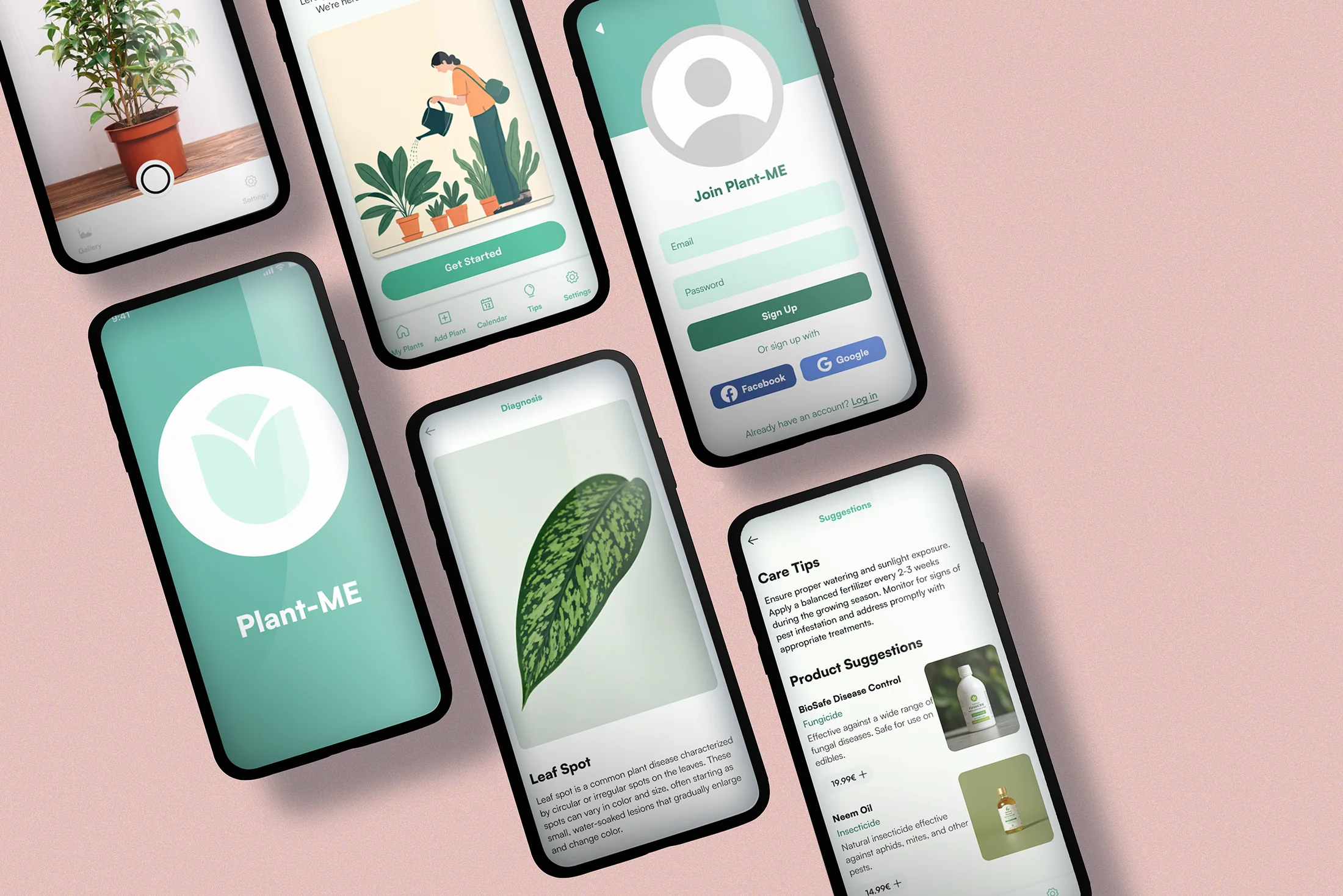
The second journey starts with a leaf scan, presents the diagnosis and leads to care recommendations and concrete solutions.
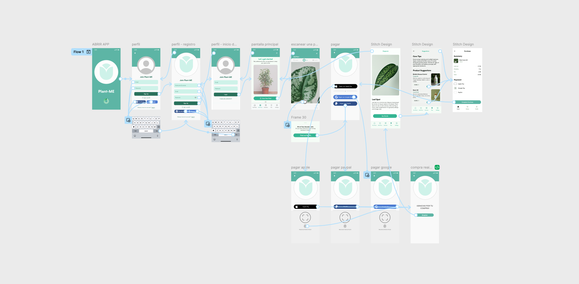
Each interface decision responds to a need identified during research.
The goal was not to add features, but to reduce uncertainty and make daily plant care easier.
Insight:People needed to solve specific tasks.
Decision: Instead of organising the app by categories, I structured navigation around the actions users perform most often: identifying a plant, checking its care or following up.
Result: Navigation is connected to what the user needs to do.
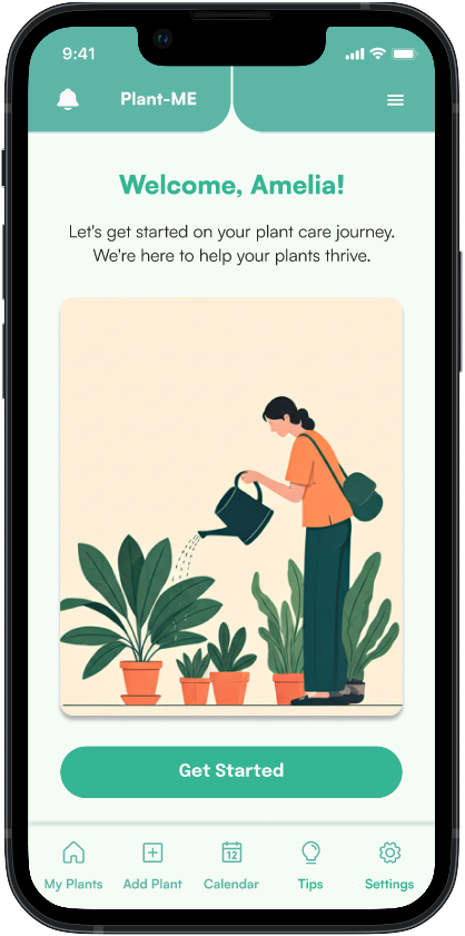
Insight:Care needed continuity.
Decision: "My Home" became the starting point for the whole experience. It brings together plant status, care calendar, recommendations and access to diagnosis.
Result: Daily care is gathered in a single view.
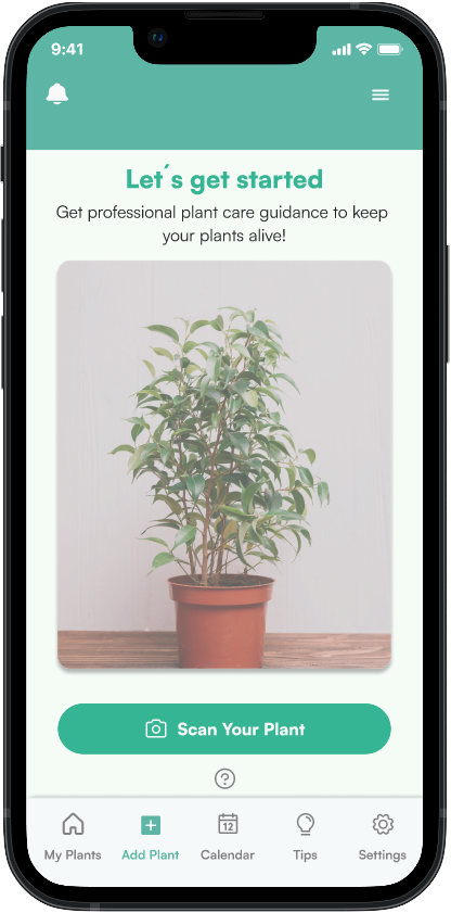
Insight:The user needed to know what was happening to a plant without going through several steps.
Decision: Scanning became prominent in the main flow to reduce the steps needed to get a recommendation.
Result: The critical action appears earlier and more clearly.
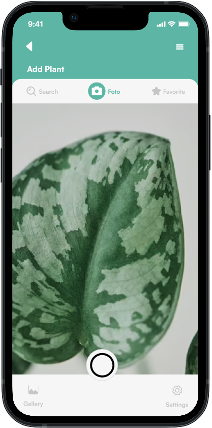
Insight:Usability testing detected small friction points.
Decision: Adjust the visual hierarchy of the main actions.
Result: Access, orientation and scanning gain clarity without adding complexity.
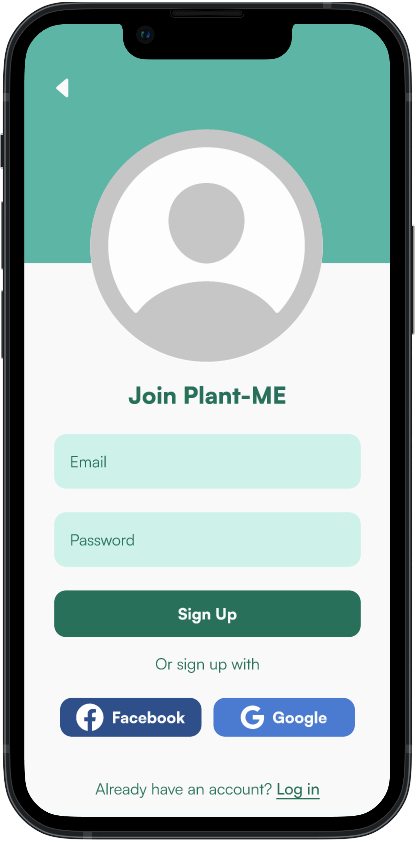
I tested the prototype recording screen and audio while they completed two tasks: signing up and scanning a plant.
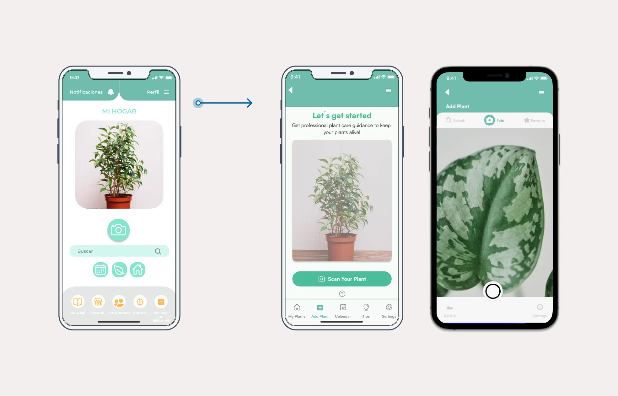
ProblemIn testing, all three people hesitated over where to tap to scan a plant: the camera was hidden among other options and the diagnosis took several steps to appear.
SolutionI turned scanning into the main action on the home screen, with a large, persistent camera button leading straight to the diagnosis.
These improvements came directly from testing, not intuition: I reorganised access, welcome and scanning so the experience could guide the next step better.
Access was simplified to prevent registration from blocking initial exploration.
All three users expected the welcome screen to change on its own; I added a loading indicator so it would advance automatically, with no need to tap the screen.
All three struggled to find where to scan: the camera CTA gained presence so diagnosis could start without a prior search.
The result is a mobile app designed to support plant care in a simple way, reducing uncertainty through a clear, guided and action-centred experience.
08 / Looking back
Looking back
Plant-Me allowed me to see how good research not only helps understand people, but also helps make better design decisions.
If I continued developing the project, I would go deeper into personalised recommendations and validate the experience with more users to keep refining the product.
Back to projects ↗