Explore · Rest · Taste · Prepare · Share
 ← Back to projects
01 / ContextWeb redesign
Organising a complex route without losing its cultural identity.
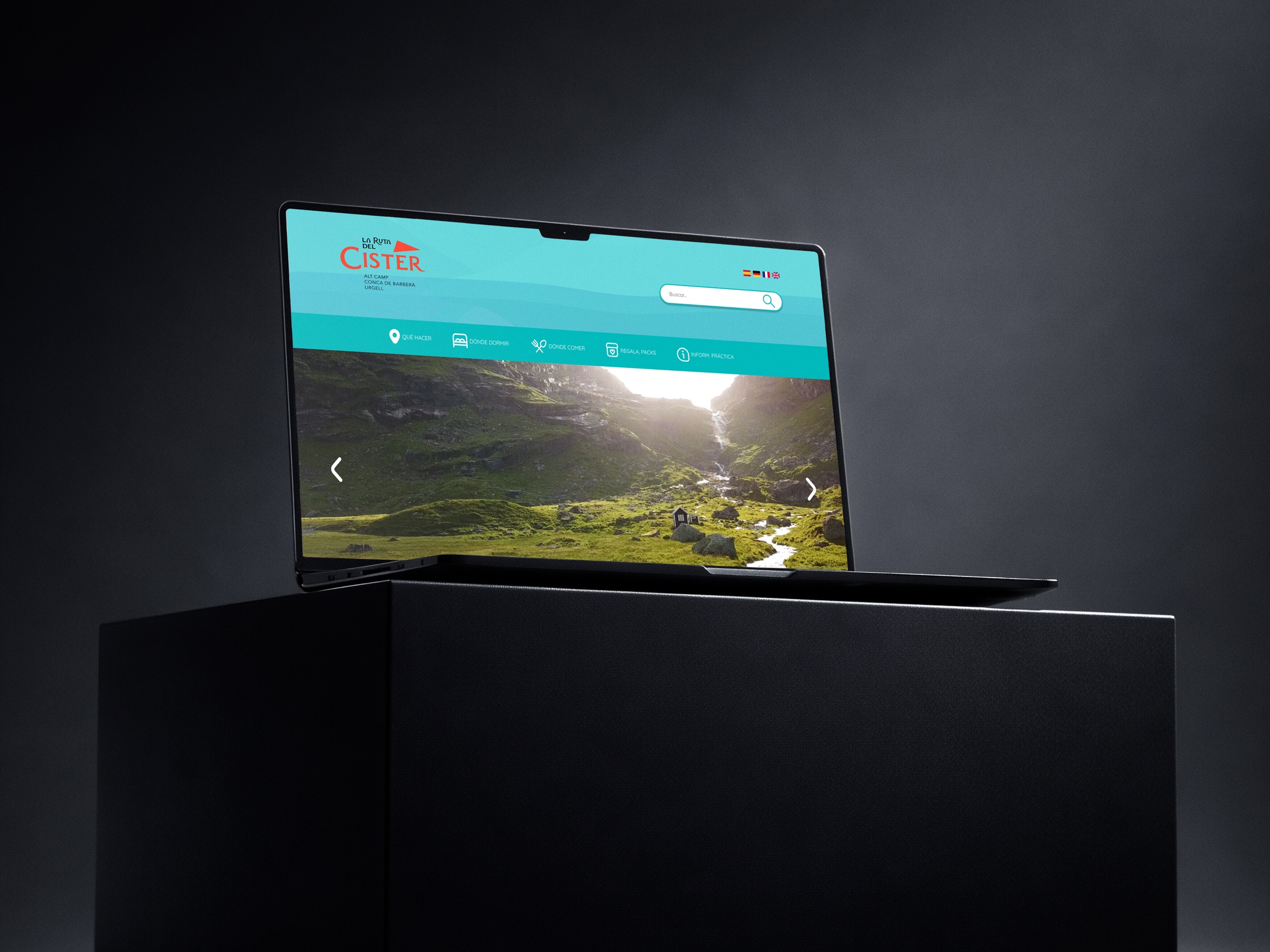
The Ruta del Císter brings together monasteries, itineraries, accommodation, gastronomy, events and practical information. The redesign reorganises this content so visitors can discover options, compare them and prepare a complete experience.
- My role
- Researched the original site and identified friction points
- Redesigned the information architecture into five content blocks
- Built a visual system (colour, type, icons) for desktop and mobile
- Prototyped the full experience in Figma
- System
- Desktop, tablet and mobile
- Result
- Responsive tourism website
- Tools
- Figma · Photoshop
Find.
Explore.
Plan.
Reducing information overload on a tourism website with a large amount of content and turning it into a clear experience for preparing a visit.
Understand
before designing.
The original website contained useful content, but its navigation did not help visitors decide what to see, where to sleep or how to organise the route.
Before working on the interface, the focus was on identifying which information needed stronger hierarchy: menu, search, filters and access to key content.
03.1 / Structure
Organising journeys before finalising screens.
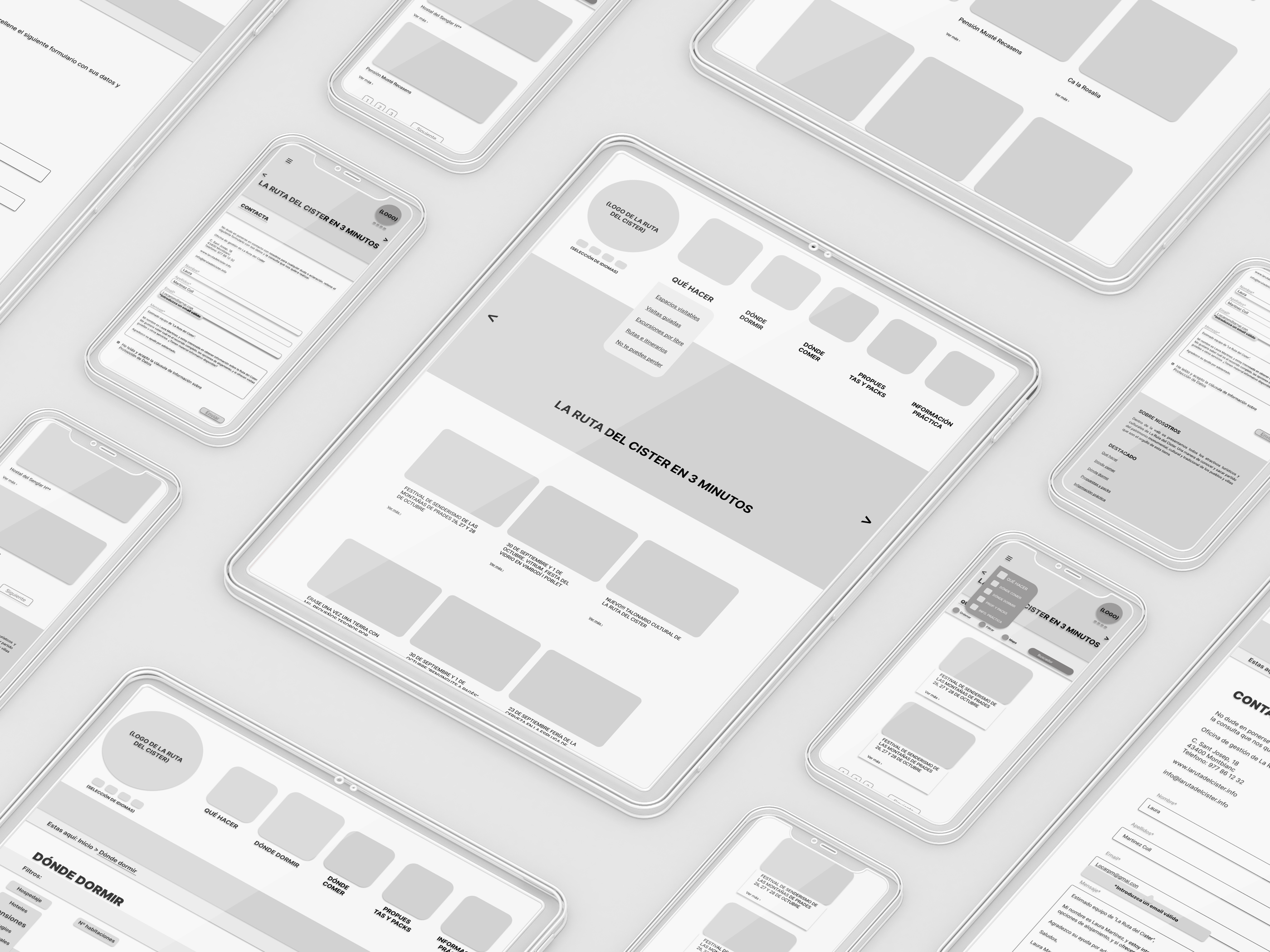
The wireframes helped reorganise navigation, search, filters and content cards across desktop and mobile.
04 / Translating findings into design decisions
From accumulated content to clear decisions.
The findings became four decisions: reorganise the architecture, turn the homepage into a planning point, prioritise search, filters and cards, and support everything with a responsive system.
Monasteries, itineraries, accommodation, gastronomy and events in recognisable blocks.
Visible access to routes, accommodation, events and useful content.
Reusable modules to compare, decide and maintain consistency across screens.
04.1 / Visual system
A shared language for orientation.
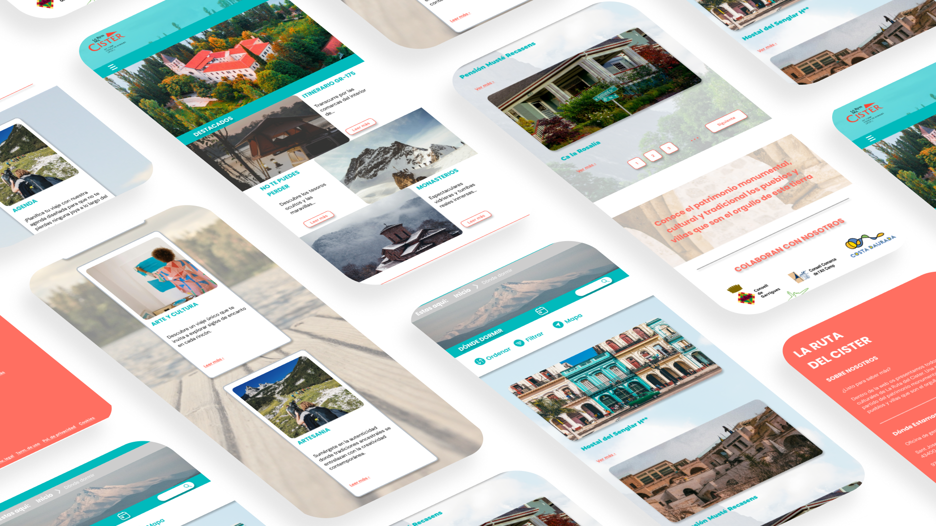
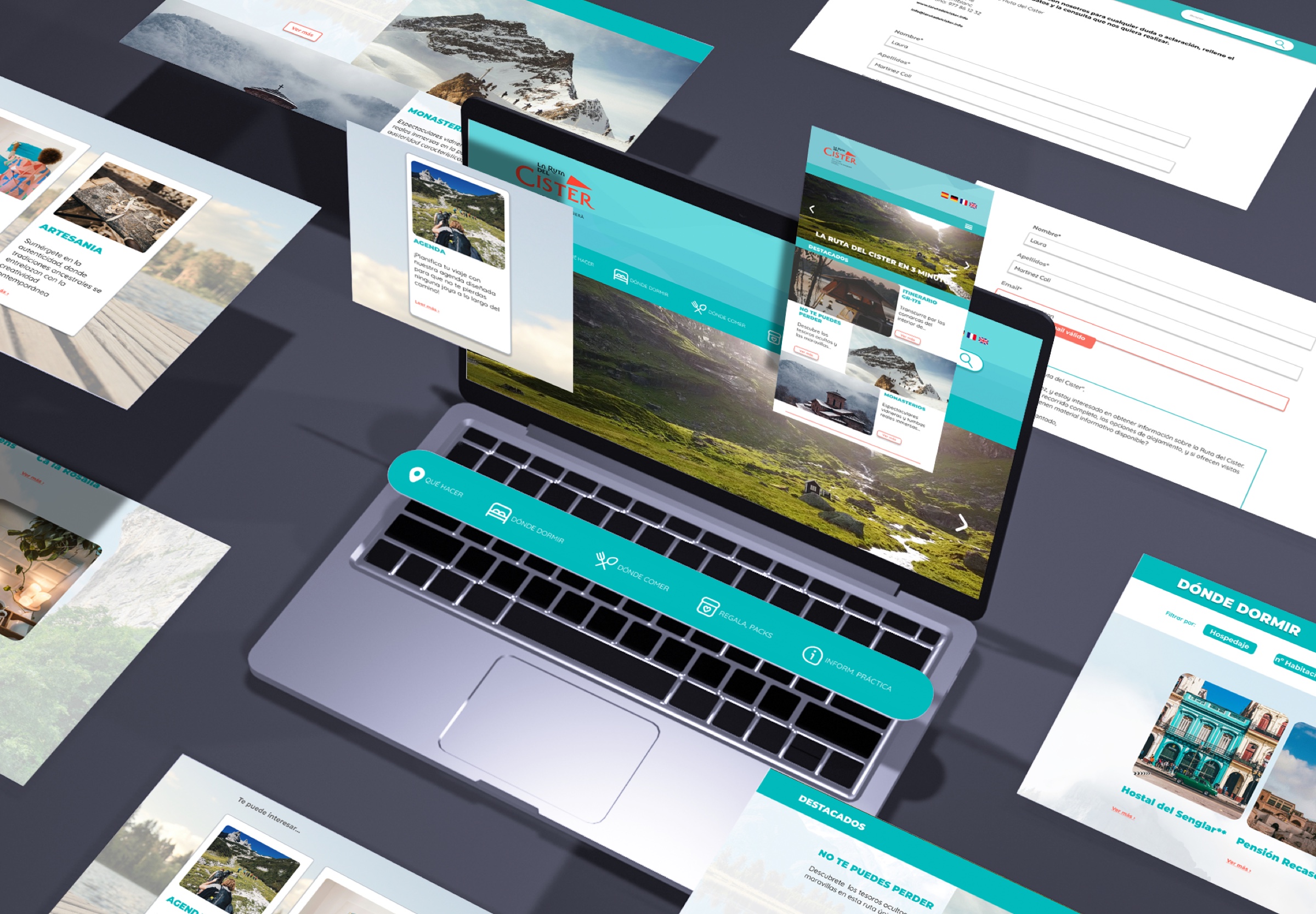
Grid, colour, typography, buttons and iconography were defined as a visual system to keep navigation clear and consistent across desktop and mobile.
Colour to orient.
Typography to guide.
Colour system
Turquoise
#008DA1#00A1AB#01BABC#62D4CE#8BE8DD
Navigation · structure · orientation
Coral
#E84255#F25859#FF6F61#FF856B#FF9872
Action · emphasis · calls
Neutrals
#FFFFFF#F2F2F2#E6E6E6#CDCDCD#686868#000000
Reading · background · balance
TypographyAa Aa
MontserratHeadings · Semibold / Black
QuicksandBody · Regular / Medium
Components designed to recognise, decide and move forward.
Icons, buttons and forms keep the same visual language so actions remain recognisable on desktop and mobile.
Categories and main actions.
Linear, legible iconography prepared to work in turquoise, coral or in positive over coloured backgrounds.
Visible states without breaking the composition.
Coral concentrates actions and calls; turquoise organises navigation and confirmation. Grey is reserved for inactive states without competing with the main actions.
Form and system feedback.
Checked
Selected
On
The route continues on any screen.
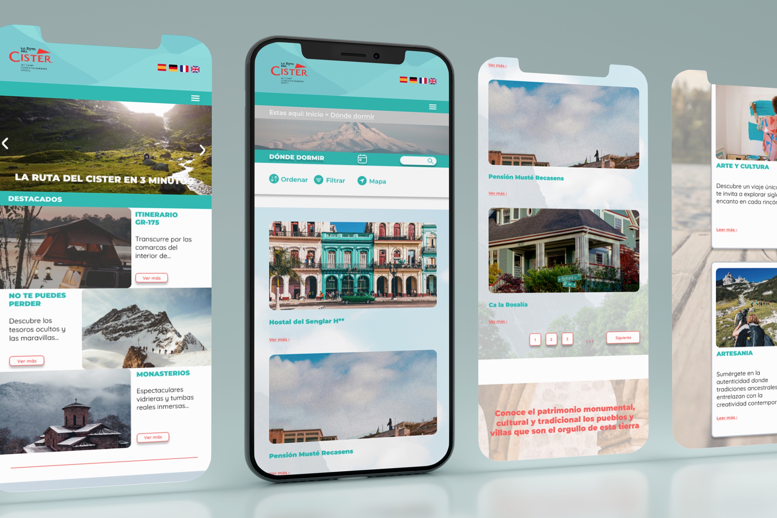
05.1 / Responsive result
A functional interface that leaves room for the territory.
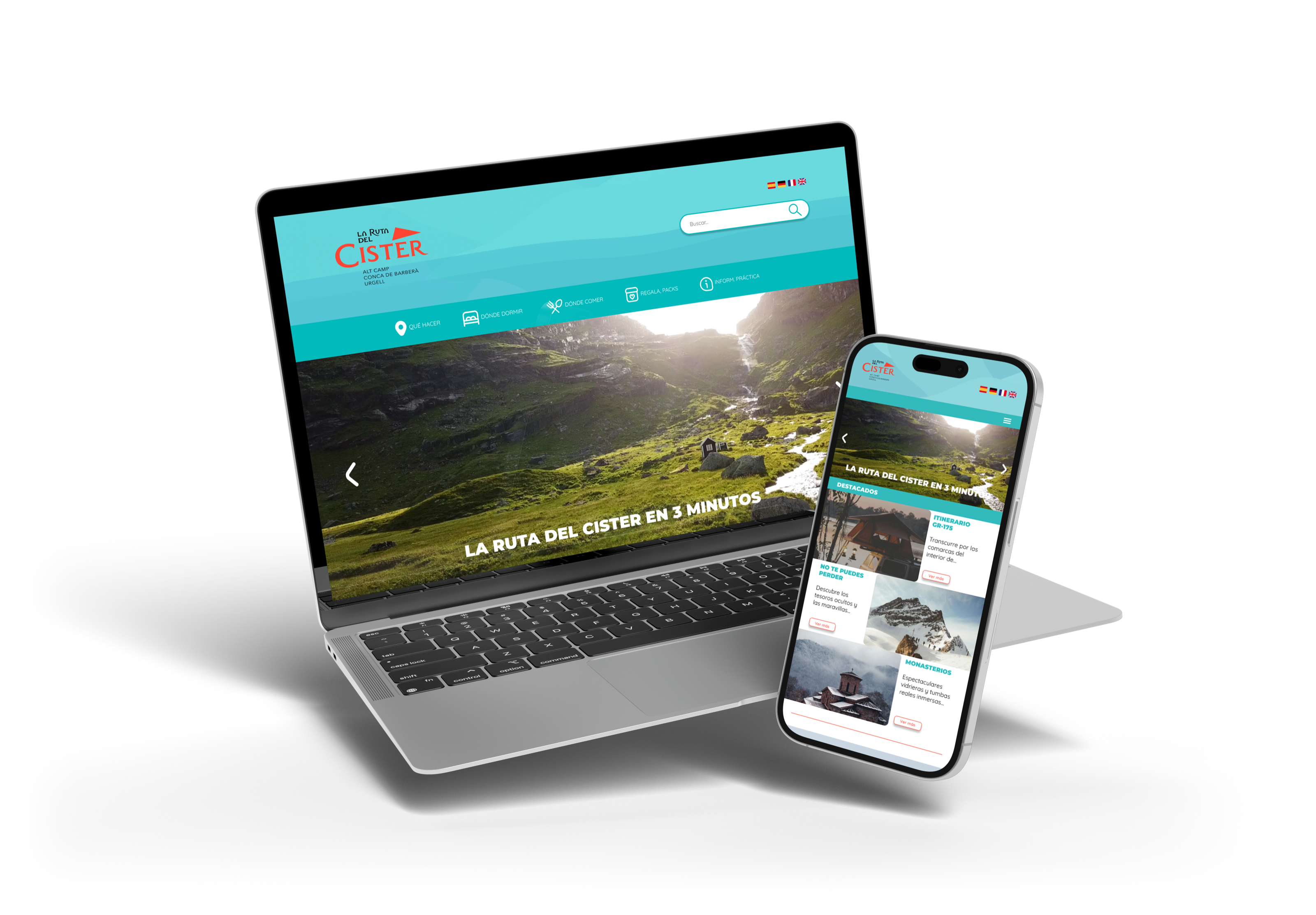
06 / Looking back
“Designing tourism is designing decisions.”
The right structure makes it possible to discover, compare and plan without getting lost in content.
Back to projects ↗