#171717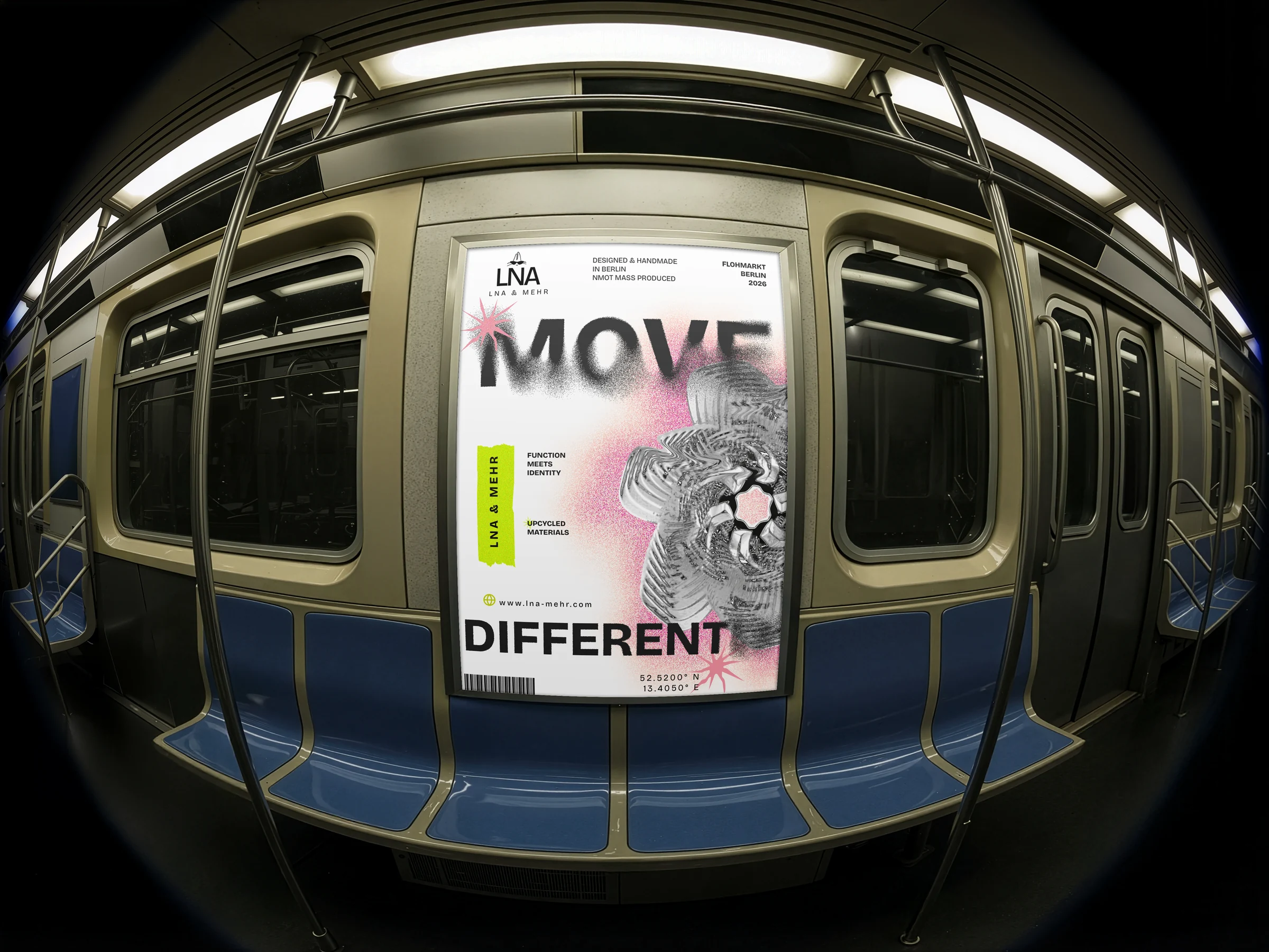 ← Back to projects
01 / ContextVisual identity
A handmade brand born between flea markets, self-expression and Berlin’s alternative culture.
LNA & MEHR creates unique handmade pieces from reused materials. The brand comes from Elena’s personal project, as she aims to professionalise her craft practice and start selling her products in markets and creative spaces across the city.
- My role
- Defined the brand strategy and visual positioning
- Created the cat character as the identity's central symbol
- Designed the system applied to packaging, social media, posters and web
- Wrote the brand's verbal language
- Scope
- Identity, verbal language, packaging and web
- Tools
- Figma · Illustrator · Photoshop
- Context
- Real case · Emerging brand
Function
+ identity.
The main issue was the lack of a defined corporate identity, which made the brand harder to recognise and position in a highly competitive and visually saturated market.
The identity needed to communicate the project’s values, aesthetic universe and positioning within Berlin’s creative ecosystem in a coherent way.
Own survey56
Responses on buying habits for handmade accessories.
Handmade80%
Value handmade and small-brand products a lot or quite a lot over mass-produced ones — the basis of the identity's positioning.
not items.
ConceptFashion can be more than consumption; it can be self-expression.
DecisionBuild the identity around objects with meaning.
ResultA confident, direct and open brand.
Symbol
An open symbol.
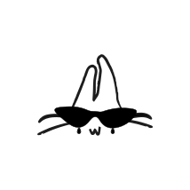
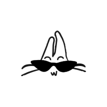
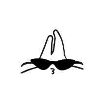
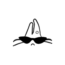
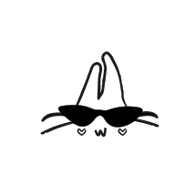
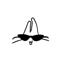
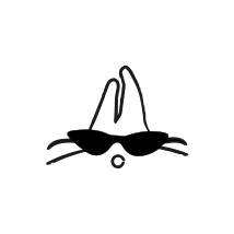
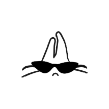
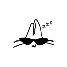
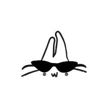
The cat represented independence, authenticity and mystery. The decision was to integrate it into the logo and turn it into the brand’s visual voice.
Not exactly
the same.
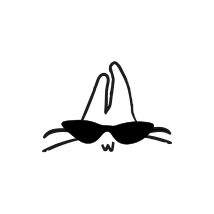
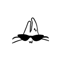
Instead of using a standard icon system, the cat responds, changes and accompanies the brand without losing its identity.
Independent.
Curious.
Never static.
Industrial,
editorial,
vibrant.
An industrial base, vibrant accents and a flexible grotesque that holds the system together.
Bricolage GrotesqueIdentity · headings · signage
Regular 400 — ExtraBold 800
Regular 400 — ExtraBold 800
04 / Identity in use
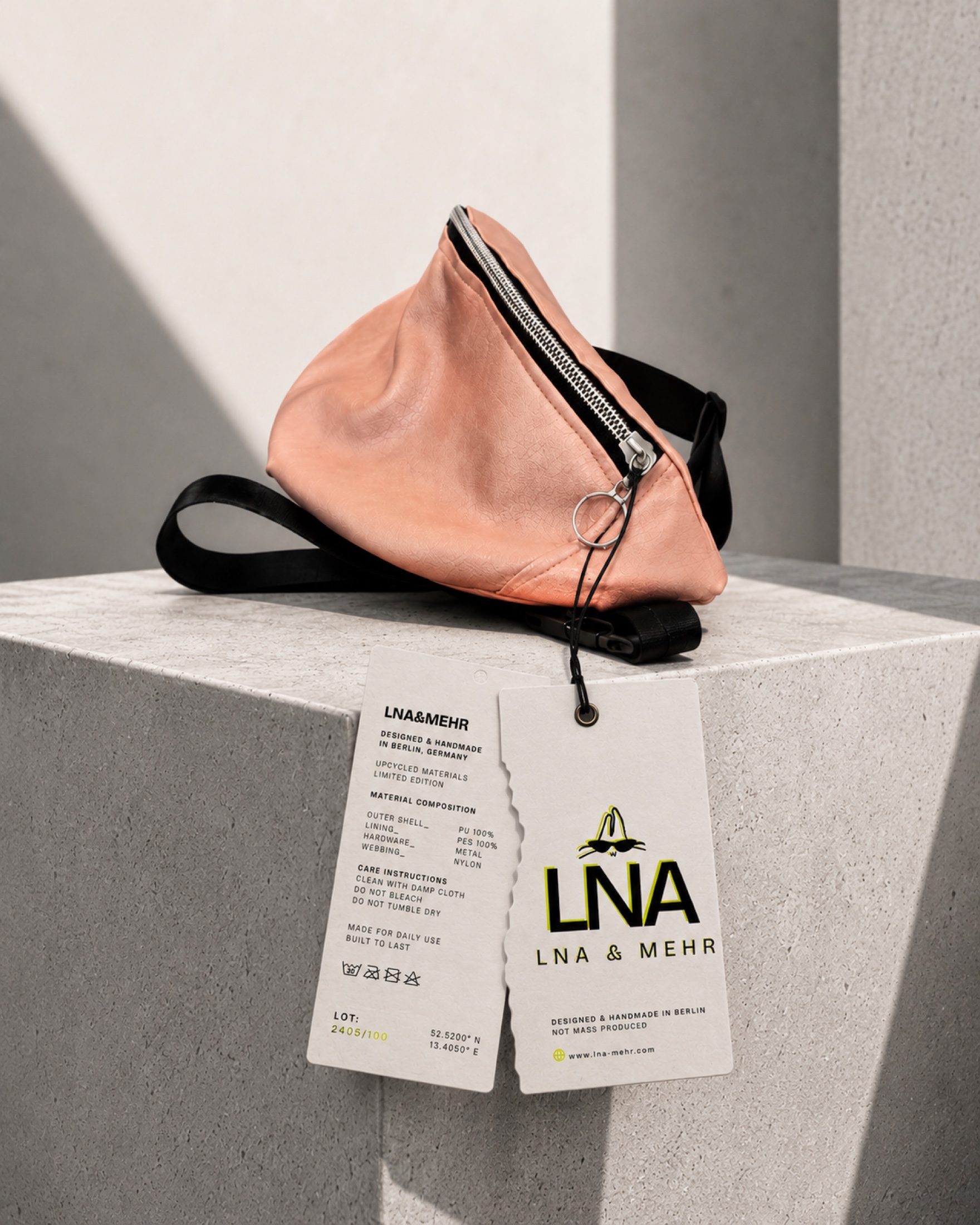
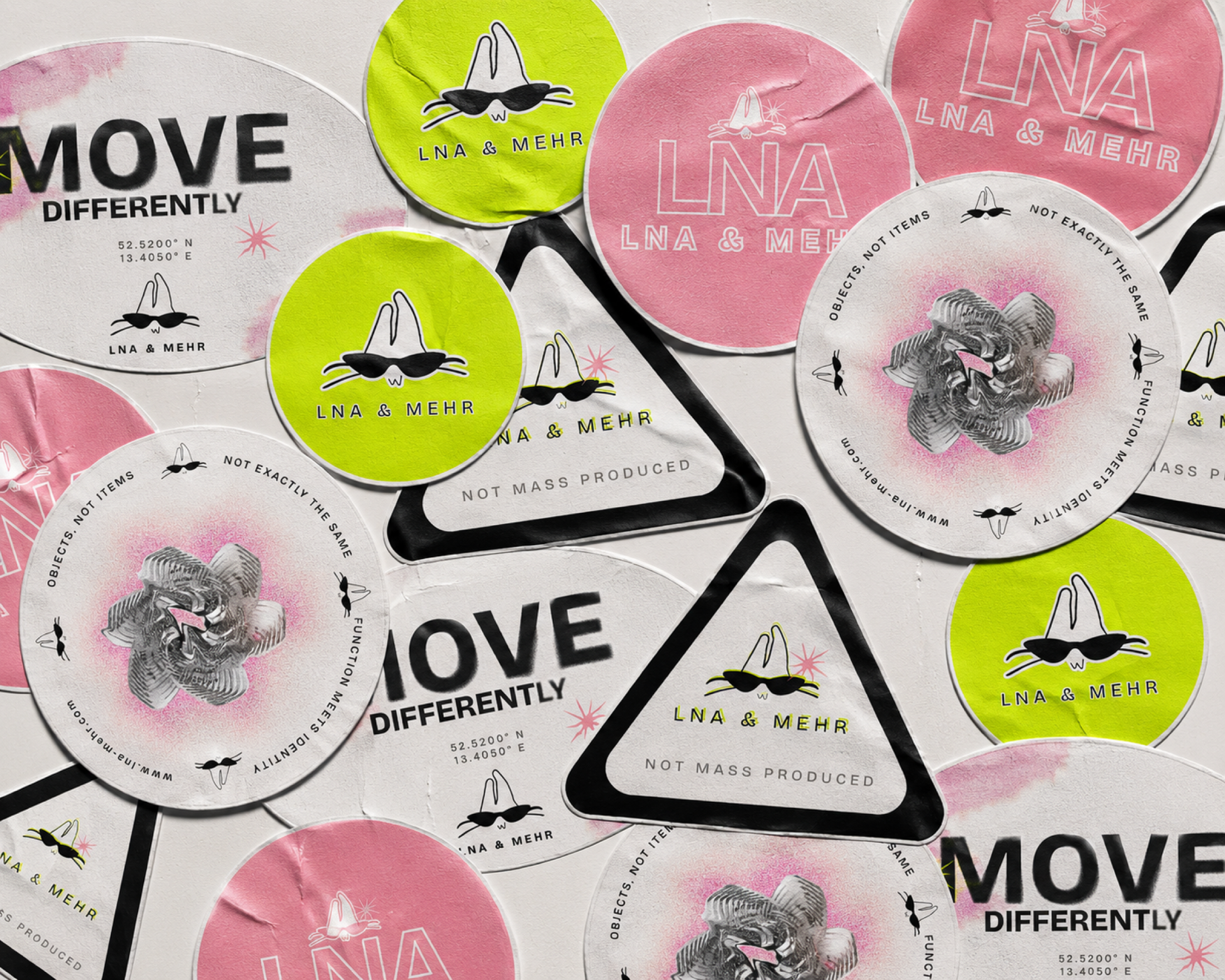
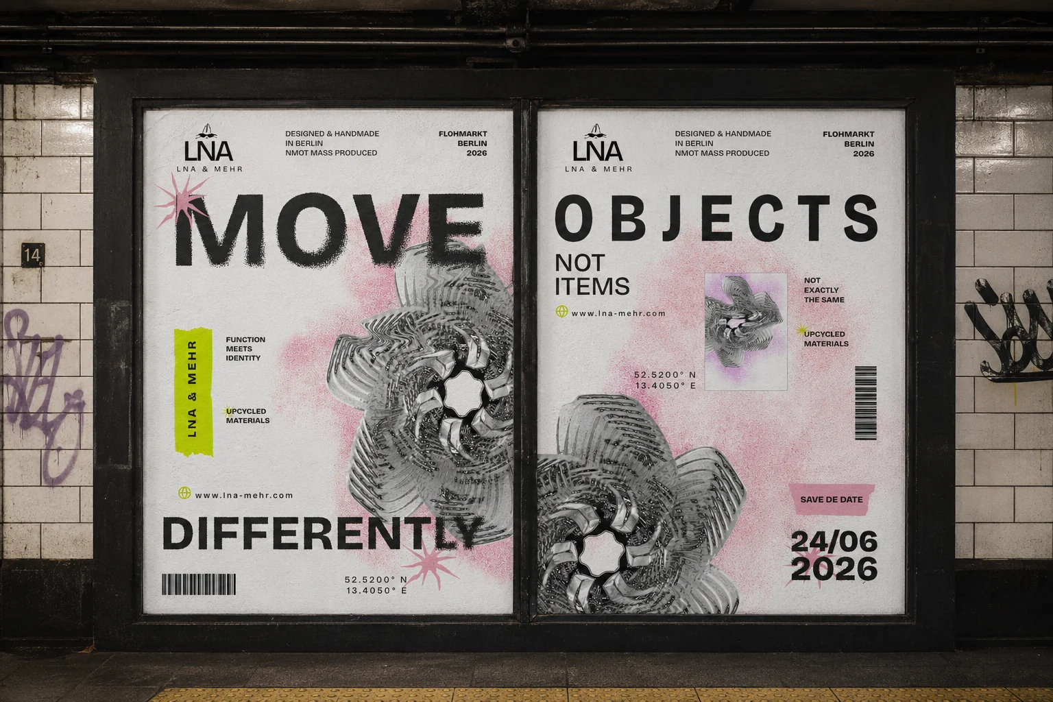
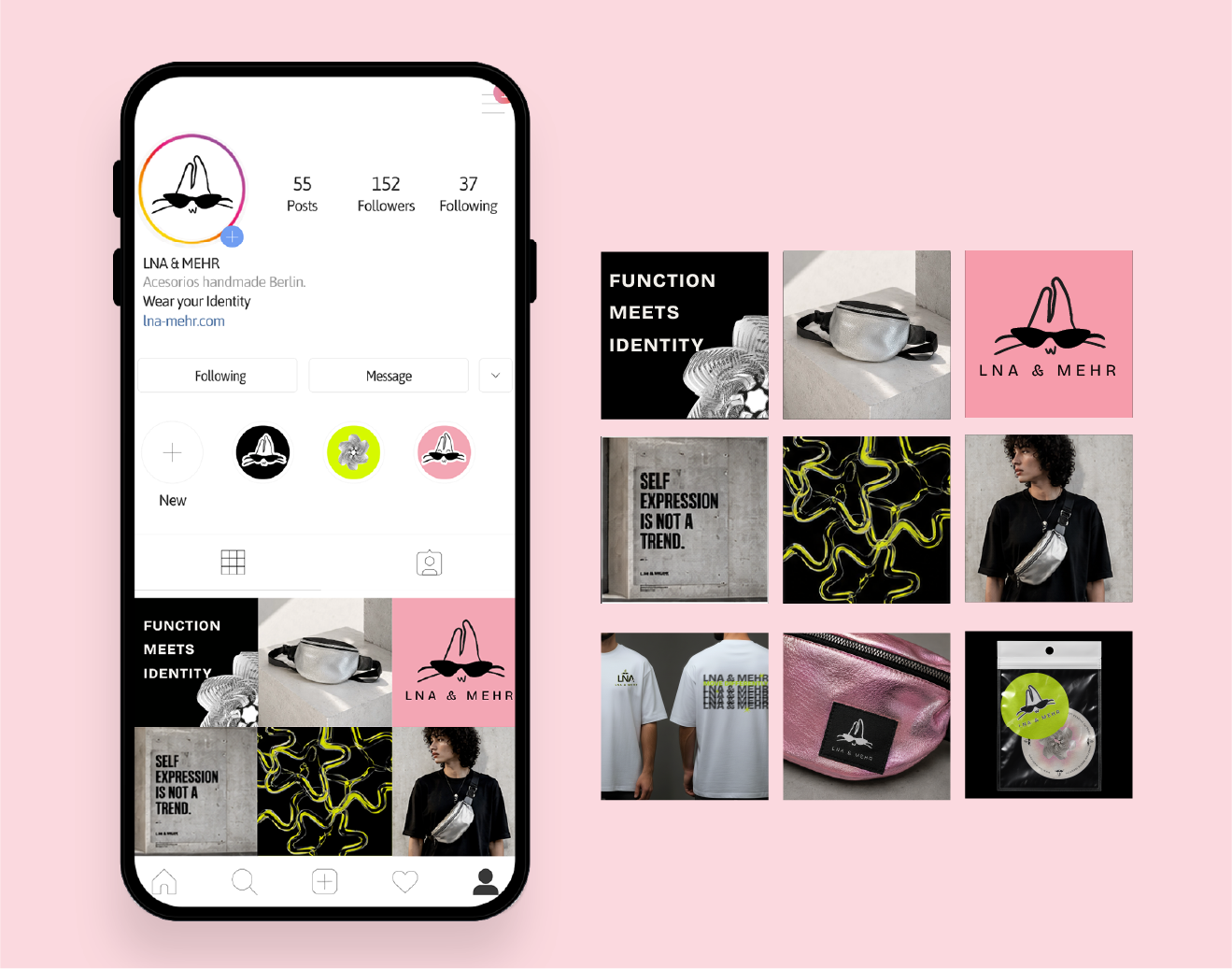
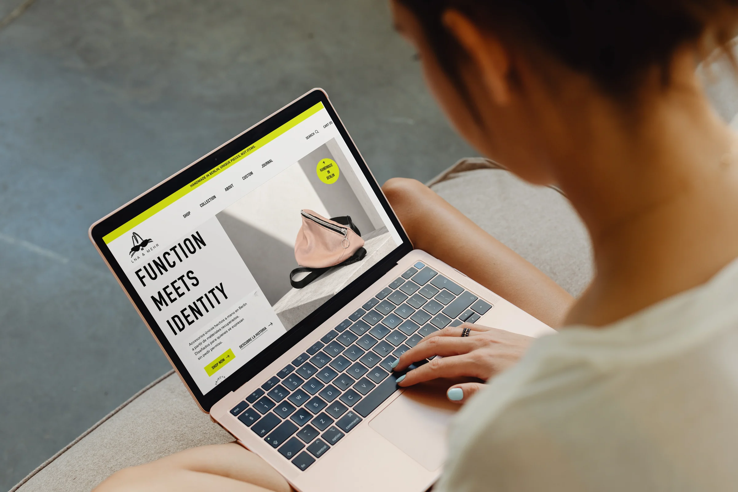
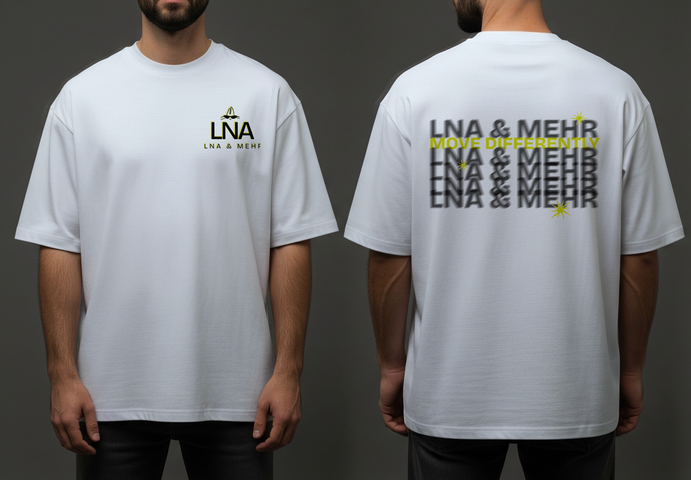
An identity that moves.
The system keeps its character from a screen to a product tag sewn onto the object.
05 / Looking back
“Function solves a need. Identity makes the object matter.”
The project turns a real craft practice into a recognisable and scalable brand, without separating product, cultural context and personality.
Back to all projects ↗